|
|
|
|
|
|
|
|
|
|
 |
|
|
|
|
|
|
|
|
|
|
||||||
 |
|
|
|||||||||||||||||||||||
|
|
|
|
|
|
|||||||||||||||||||||
|
|
|
|
|||||||||||||||||||||||
|
|
|
|
|
|
|||||||||||||||||||||
|
|
|
|
|
|
|||||||||||||||||||||
|
|
|
|
|||||||||||||||||||||||
|
|
|
|
|||||||||||||||||||||||
|
|
|
||||||||||||||||||||||||
|
|
|
|
|
|
|
|
|
|
|
|
|
|
|
|
|
|
|
|
|
|
|
|
|
|
|
|
|
|
|
|
|
|
|
|
|
|
|
|
|
|
|
|
|
|
|
|
||||||
|
|
|
|
|||||||||||||||||||||||
|
|
|
|
|
|
|||||||||||||||||||||
|
|
|
|
|||||||||||||||||||||||
|
|
|
|
|
|
|||||||||||||||||||||
|
|
|
|
|
|
|||||||||||||||||||||
|
|
|
|
|||||||||||||||||||||||
|
|
|
|
|||||||||||||||||||||||
|
|
|
||||||||||||||||||||||||
|
|
|
|
|
|
|
|
|
|
|
|
|
|
|
|
|
|
|
|
|
|
|
|
|
|
|
 |
 |
 |
 |
 |
 |
 |
 |
 |
 |
 |
 |
 |
 |
 |
| Taking pride in the work we do is something our clients have come to
expect from us. Every project is as unique as the customer behind it. As a
result, no one project is ever the same. We work closely with you to
better understand your vision.
Over the years we have worked on countless projects in many different areas. It is not possible to display all of them here so we have gathered some of our favorites. |
|
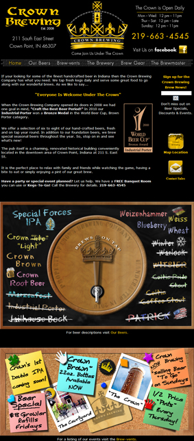
The Crown brewing company needed a complete redesign of their website and new branding for their beer line including beer label and themes. |
|
||||
|
|
|
|
|
|
|
|
|
|
|
|
|
|
|
|
|
|
|
||
|
|
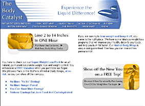
The Body Catalyst was a business that provided excellent health and nutritional products. When we began this site, the customer wanted something simple. We spent a fair amount of time working on what graphics would best project the proper image of the company and products. We settled on a nice blue with gold accent since those colors worked to give the site a natural look and feel. We used some light gray boxes to separate the colors and promote the other colors. |
|
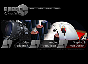
Cubed Creations website is always evolving and growing. This latest version has gone in the direction of a more digital, high-tech feel. Using a strong gray metallic base with primary colors used as accents. The use of close-up photography grabs a viewers eye and provides visual impact. The design of the user interface was completely reworked to make it more user-friendly and promote the type of services we offer. |
|
|
|
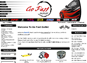
Go Fast Outlet is a web based automotive performance parts dealer. They needed us to create a complete shopping cart system and website for their products. The site has a full array of custom buttons and graphics which provide a clean professional look and feel to the website. |
|
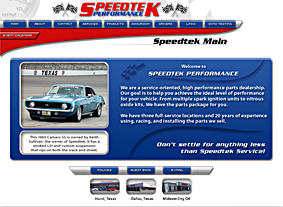
Speedtek Performance wanted a complete redesign of their existing website. They wanted to retain their logo but add new features and a new look and feel to their website. We also had to create a full shopping cart system for their products. We started off utilizing the colors in their logo and worked on a clean professional design. With red and blue being the primary colors in the logo, we tried to expand on the colors with blue being the primary color and red used as an accent color. Additionally we used some grays to help separate the colors and add some depth to the page. |
|
|
|
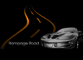
Rampage Road was built for displaying videos of drag racing and other items related to cars and racing. Using a simple set of colors against the black background to give the site a unique look and feel, the site has a clean feel to it so that visitors focus on the material. Other features include mouse-over reveal information boxes. These give the look and feel of a flash type site without using flash. |
|
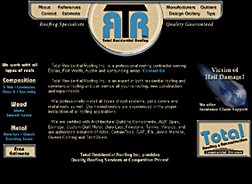
Total Roofing is one of our long standing clients. The graphic work, like the company, has grown and changed a lot over the years. The latest version of their website has a clean, simple feel to it. Set on a black background with tans and blues making up the main colors, it has a classic look to it. The companys new logo has been incorporated as well. |
|
|
|
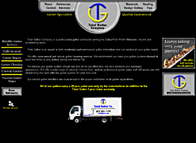
Total Gutter Company is a sub-division of Total Roofing & Reconstruction. Over the years we have worked on maintaining a similarity between the companies while giving them each their own identity. The samples below show a few different forms of products we have used their graphics on and how we adapted the logos to each one. All of the logo work we do is designed to incorporate present, future and even past forms of media. |
|
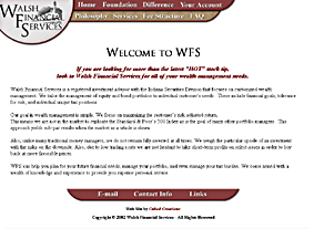
One of our earlier clients was Walsh Financial Services. We created the company logo, letterhead and website. The logo is a lighthouse which symbolized the company and the services they offered through consulting. The bars were kept clean and elegant looking using maroon and gold colors. |
|
|
|
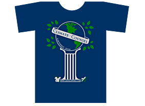
Fisher & Phillips Law Firm needed a T-Shirt design for Earth Fest. We had to create a logo and team name that represented the firm and the event in a creative way. We came up with Climate Counsel for the team name. The logo itself included the earth on top of a column which represented the law supporting the earth. A few other extras were added to symbolize the event like the squirrel, grasshopper and leaves. |
|
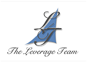
We created a number of logos for The Leverage Team. The company wanted a clean classic look to their logo. We went through many changes until we found the one they liked. The logo was used in both web and print applications. We have included some earlier ideas below so you can see how we work with our clients until we come up with a logo they like. |
|
|
|
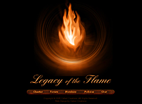
Legacy of the Flame was a website created for a video game based guild. The flame was custom made which turned out being very unique and worked as the center piece for the website. We used an elegant script font for the logo while the bottom bar used a simple font on top of a nice metallic bar. |
|
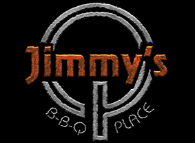
Jimmys Q BBQ Place was a logo project where we used a branding type of design to the logo. We used a metallic texture with orange and silver colors. There is a lot of detail in the master which helps give the rough edge a realistic look. This logo was used in the creation of the companys business cards and other related print material. |
|
|
For Professional Photographic services please visit
|
For Fine Art by Royce Bishop
Please visit my online art gallery. |
R-idiom is a blog where you can keep up with Royce's latest projects and news.
|
|
For The Best Web Hosting Click Here
|
||
© 1997-2012 Cubed Creations. All rights
reserved. Web Design by
Cubed Creations
Hosting by InMotion Hosting
![]()